


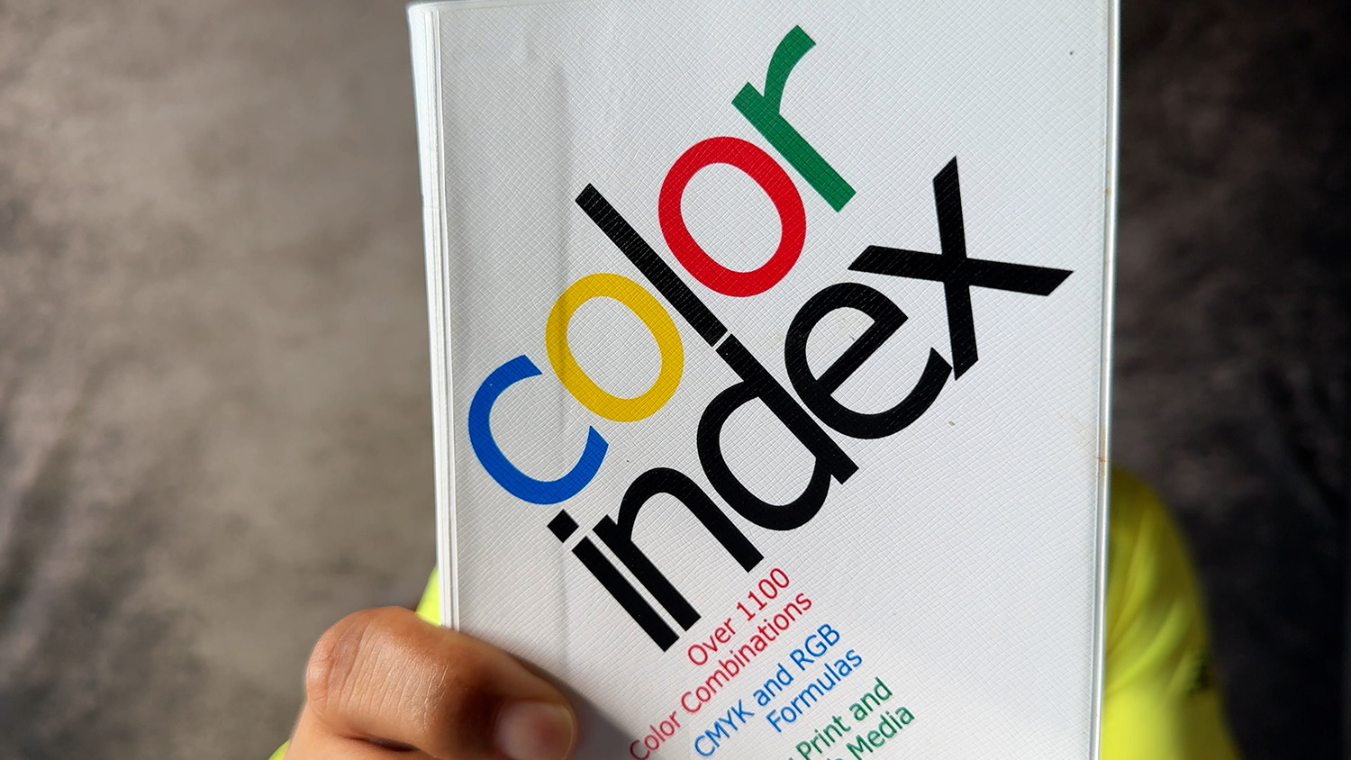
As a graphic design student, I relied on color theory books like Jim Krause’s “Color Index” for inspiration. But once I became a professional creative, I realized the best color combinations aren’t in books—they’re all around us in the real world.
What I Cover:
- Why I moved from design books to real-world color hunting
- How companies spend hundreds of thousands on color schemes you see daily
- Finding color inspiration in your own closet and shoes
- Why grocery stores are goldmines for color combinations
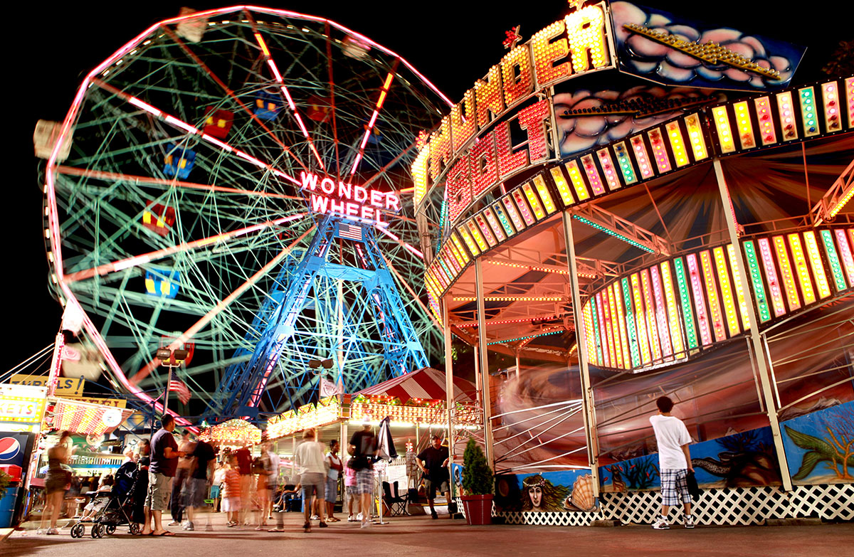
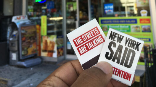
- How subway ads and billboards teach you about attention-grabbing design
- The power of black and white and what missing colors communicate
- Why cereal boxes are masterclasses in color psychology
Key Insight: Someone got paid serious money to choose every color you see on products, packaging, and advertisements. Instead of searching “business card inspiration,” look at the Jordans on your feet, the cereal in your kitchen, or the MTA ads on your commute.
Real-World Color Inspiration Sources:
- Your own wardrobe and footwear
- Grocery store packaging (yogurt, juice, cereal boxes)
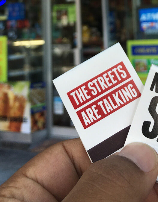
- Subway and billboard advertisements
- Street signage and brand logos
- Everyday products designed to grab attention
Stop overthinking color theory and start observing the world around you. The best color combinations are hiding in plain sight.
Thanks for walking with me.